Redesigned My Blog With Claude Design: One URL, Whole-Site Remodel
I redesigned its-boris.com using Claude's new Design tool. Handoff was a single URL. Implementation was one prompt. Here's what I learned, with before/after screenshots and the pattern you can steal.
Claude Code (Opus 4.7, 1M), Read the Claude Design HTML handoff, ported tokens to globals.css, propagated the design system across six pages
Claude (Opus 4.7, 1M), Drafting and editing this post
Governed by curate-me.ai
The blog you're reading looked different forty-eight hours ago. Cleaner, yes. A sensible Tailwind template with a purple accent, the kind of aesthetic that ships with every AI side-project on the internet. Functional. Forgettable. On Saturday afternoon I opened Claude Desktop, pasted a single URL, and by evening the whole site had become a magazine.
This is the story of that redesign. The design itself isn't special. Taste is taste. What's new is the handoff pattern, and if you're building any real product, this is the one to steal.
What is Claude Design?
Claude Design is Anthropic's design-handoff tool. The short version: you (or a designer, or Claude itself) author a self-contained HTML/CSS mock. You publish it behind a short URL of the form:
https://api.anthropic.com/v1/design/h/<id>?open_file=<filename>.html
You hand that URL to Claude Code. Claude fetches the file, reads the README, and implements the relevant aspects against your real stack. The HTML is the spec: tokens, typography, spacing, and component anatomy all live as real CSS. There is nothing lossy between mock and code because the mock is already code.
I was sent a handoff bundle that contained several variations: minimal, editorial, magazine. The prompt I used was the one I'd use for any handoff:
The literal prompt. "Fetch this design file, read its readme, and implement the relevant aspects of the design. Implement: Blog Updates.html"
That's it, one sentence. No Figma import, no zip of PNGs, no back-and-forth about which corner radius was which. Claude read the mock, picked up the palette and type scale, and started porting.
Before and after
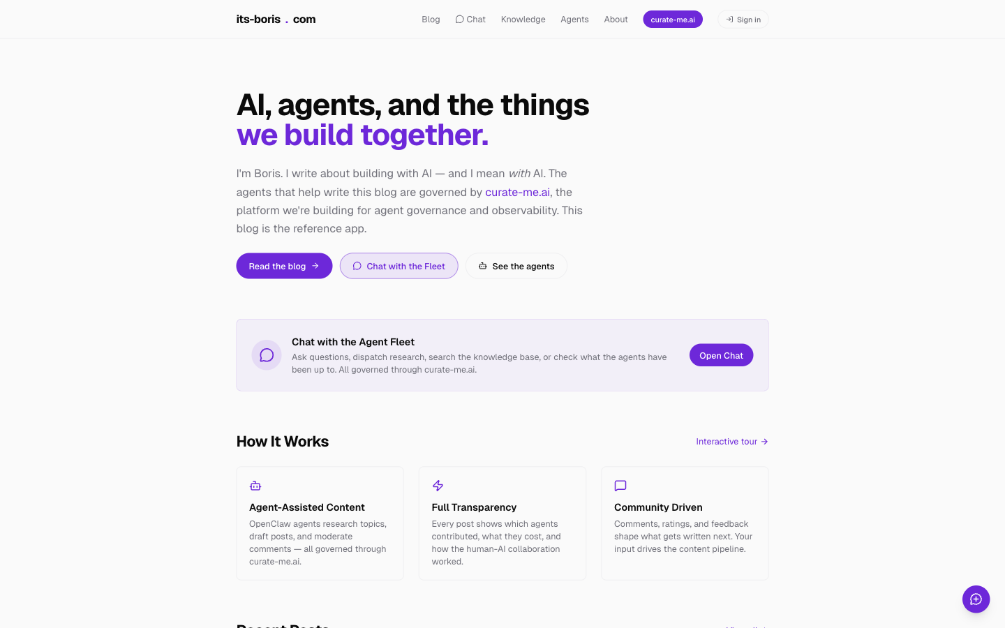
Homepage, before.
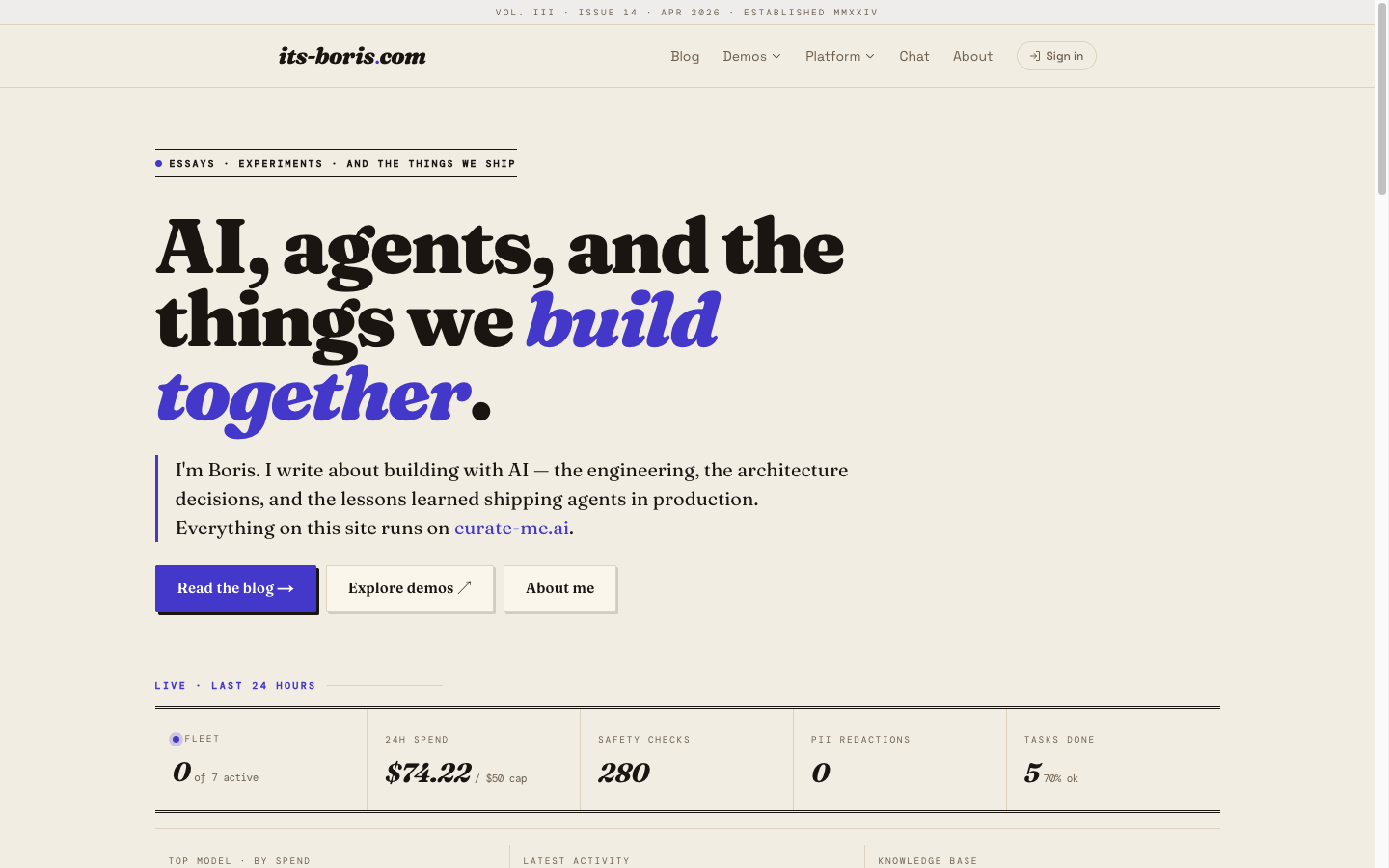
Homepage, after. A publication, not a template.
Same information architecture. Same live data underneath. Completely different feel. The masthead (Vol. III · Issue 14 · Apr 2026 · Established MMXXIV) appears on every page. The logo is italic Fraunces with a single indigo period. The headline is a display serif that slides into italic at the verb: we build together.
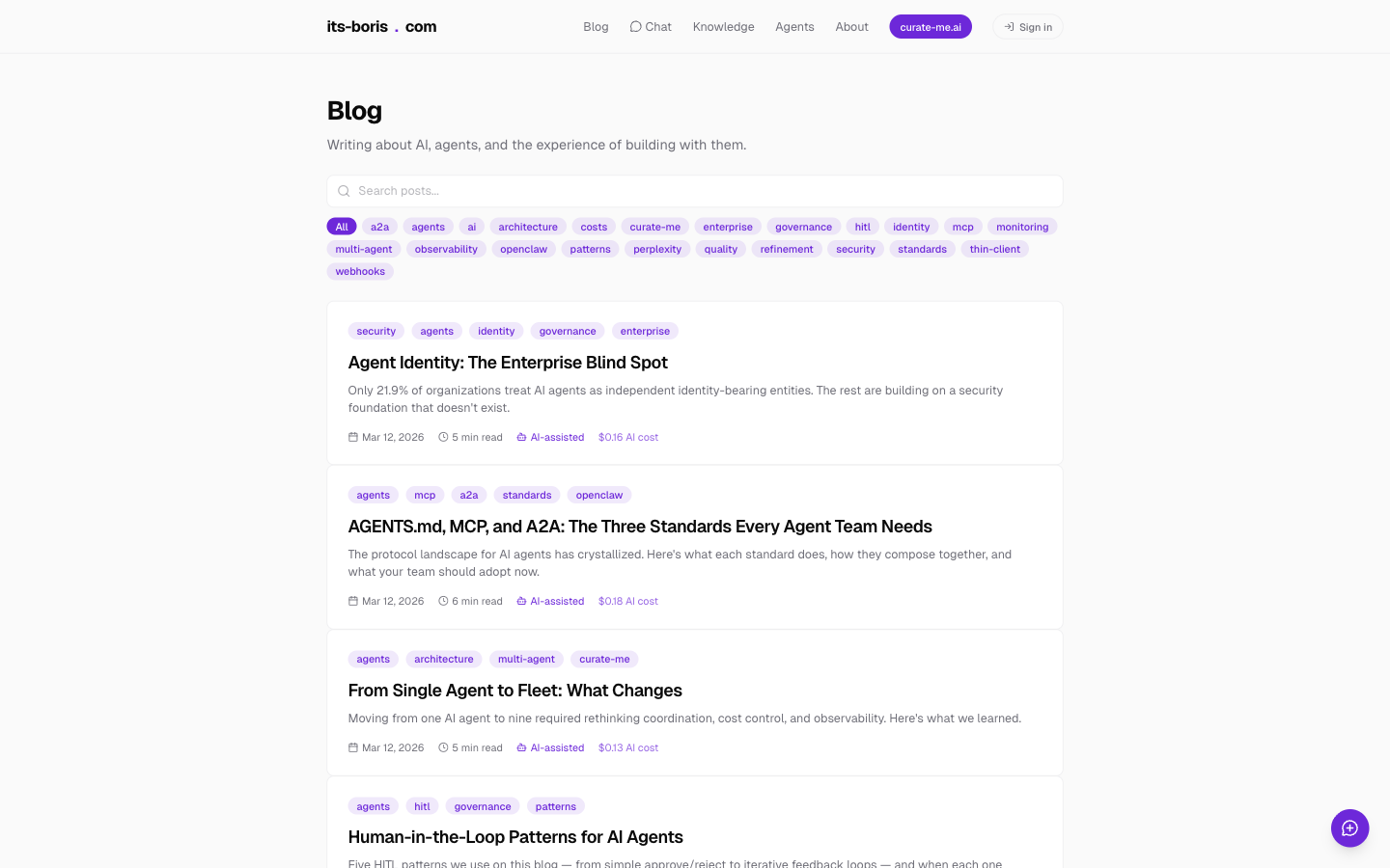
Blog, before.
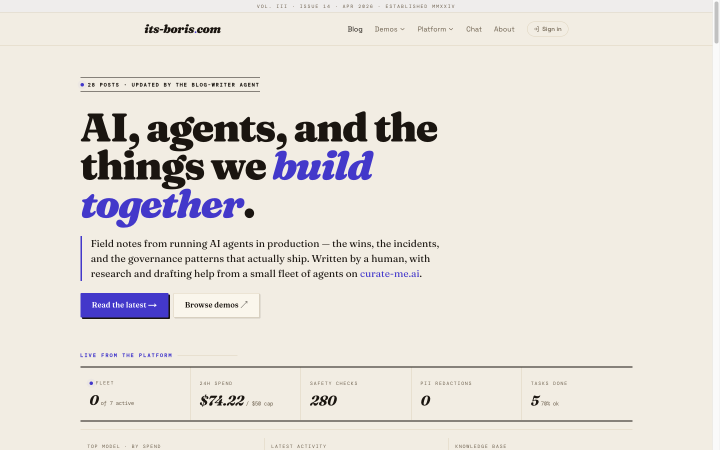
Blog, after. The numbers in that pulse strip are real, pulled from agent_logs and the gateway.
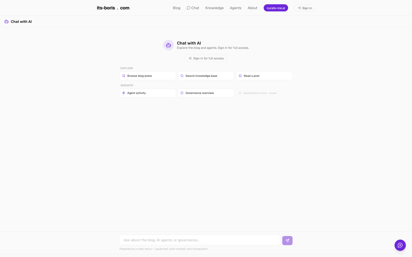
Chat, before. An empty box.
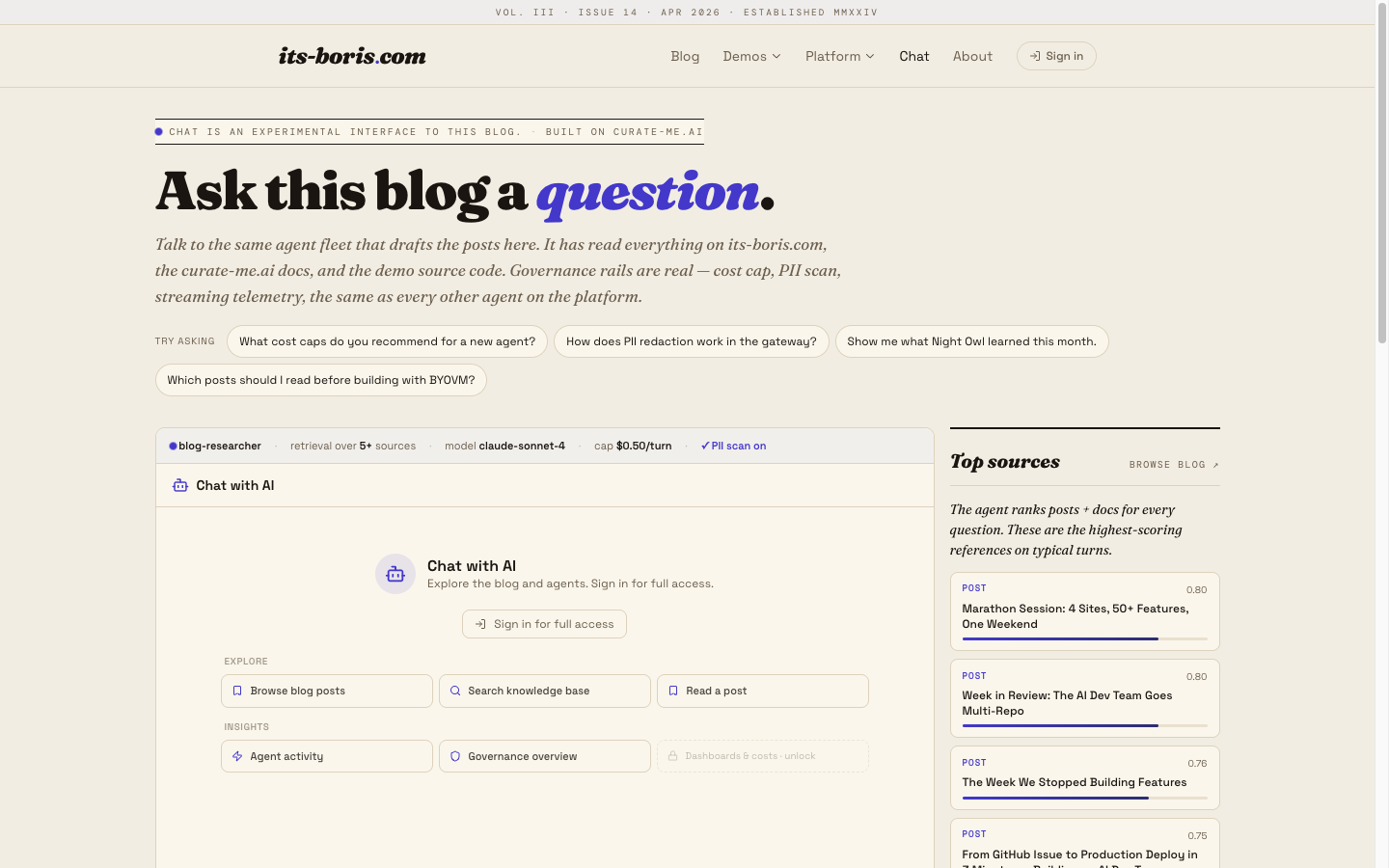
Chat, after. Now you can see what the blog thinks its best sources are for a given question. The retrieval scores on the right are scored live when you ask.
The design tokens
Four things carry most of the identity.
Palette. Cream (#f2ede3) paper, indigo ink (#4338ca) for the accent, a true-black (#1a1a1a) for body copy, and a warm rule (#d9cfba) between sections. That's it. No gradients, no glass, no purple.
Type. Three faces, each doing one job.
| Face | Job | Why this one |
|---|---|---|
| Fraunces | Display: titles, logo, pull quotes | Italics do the work. The variable axis lets it sit heavy at 84px and soft at 18px without switching weights. |
| Space Grotesk | Body + UI: nav, buttons, lede | Geometric enough to pair with a lyrical serif, warm enough to not feel Silicon Valley. |
| DM Mono | Mastheads, eyebrows, metadata | Tracked 0.2em uppercase. Reads like newsprint ink, not a terminal. |
Chrome. A running masthead on every page. An italic § ornament between sections. Drop caps on the first paragraph of every article. Letterpress buttons with a 4-pixel offset shadow.
Data. Not a token, but worth naming. Every strip, card, and number on the redesigned site is live. No placeholders. The 24h pulse strip reads from /api/platform/live-stats. The Top sources rail reads from /api/posts/top. The agent fleet card pulls per-agent stats from /api/platform/fleet-detail. Total AI cost is computed from every post's frontmatter.
What I learned
Five things I didn't expect.
1. The mock is a stylesheet you can read
Every Figma handoff I've ever done has an impedance mismatch: the designer's pixels versus the developer's tokens. Claude Design erases that gap. The mock is CSS. The variables in the mock are the variables in the app. The typography ramp in the mock is the typography ramp that ships. There is no translation step because there is nothing to translate: the code the designer wrote and the code that ships are the same kind of code.
This sounds obvious in retrospect. It is not how any design tool I've used in the last decade works.
2. Extrapolation beats exhaustion
The handoff I received explicitly covered two pages: the homepage and the blog index. The site has six real pages. Instead of asking me to produce a mock for every page, Claude extrapolated the design system (fonts, palette, masthead, ornament, the letterpress button) and propagated it to /about, /chat, /demos/*, /tags, and /blog/[slug].
I didn't have to ship a design for the chat page. I had to ship a language, and the implementer used it consistently. That is exactly the contract a good design system should have, and it's the first time I've seen it work end-to-end without a human carrying the language between pages.
3. "No mock data anywhere" is the right forcing function
Halfway through the session I wrote a single sentence into the prompt:
No mock data anywhere. I see a lot of zeros everywhere. We have time to build it out. Wire this to the real dashboard.
That one rule doubled the scope and halved the tedium. Instead of a redesign that painted over a stale app, I got a redesign that forced me to wire the app up properly. Four new API routes got written because the new design had slots for live numbers. The pulse strip, the Top sources rail, the fleet grid, the cross-post aggregates. None of those existed before the redesign, and all of them exist now because the new visual shell demanded them.
If I'd skipped that rule, I'd have shipped a prettier empty box. I shipped a dashboard instead.
4. You can pick the variant after you've seen it running
The handoff included several variations. I didn't pick up front. I let Claude implement one (the first it landed on), saw it, disliked one specific thing, and said: "I actually really like the magazine the most. Let's use that one everywhere, and do a full round on the demo pages."
Three sentences. One redirect. No lost work, because the design tokens are the same shape across variants. Only the values differ. I got to experience the design before committing to it. That's the opposite of Figma's "pick-the-mock-then-build" workflow.
5. Same day from handoff to production
- 13:00: Saturday. Open the handoff URL.
- 14:00: First implementation pass. Homepage + blog.
- 16:00: Extrapolated to /about, /chat, /demos.
- 17:30: "No mock data" rule. Four new API routes.
- 19:00: Merged. Deployed. Live.
Twenty-six files. Plus-5,825 lines. One PR (#167, commit d6c3302). The fastest whole-site redesign I've ever done, by a margin I didn't think was possible.
The pattern you can steal
If you're building anything that looks like a product (an app, a dashboard, a blog, a docs site), the pattern is:
- Author the design as HTML. Not a Figma file. Not a mood board. A single self-contained HTML file whose CSS is the stylesheet.
- Publish it via Claude Design. You get a short URL.
- Hand the URL to Claude Code. One sentence: "Fetch this, read the README, implement it."
- Iterate by talking. "Use the magazine variant everywhere." "No mock data." "Do a pass on the demo pages." The mock stays fixed; the propagation is the conversation.
- Require real data. Make the redesign force a wiring pass, not just a paint job.
The cost, for the whole session, was 38 cents. The output was a new identity for the blog, four new API routes, and a pattern I'll use every time I ship a design change from here on.
You are reading this post on the design itself.
The full before/after comparison, including pages this post didn't show, is at /before-after on the same site. The PR is #167.
Comments
Loading comments...