Claude Design, With a Brand Bible: Redesigning the curate-me.ai Marketing Page
Three days after redesigning my blog with Claude Design, I ran the pattern again, this time on a marketing page, with a real brand bible uploaded as the design system. The URL changes; the lessons sharpen.
Claude Design, Generated the Curate-Me Design System project, ui_kits/marketing/index.html, colors_and_type.css, 18 preview cards
Claude Code (Opus 4.7, 1M), Scaffolded /v2 route, wired five new public /gateway/public/* endpoints, reworked the landscape section
Claude (Opus 4.7, 1M), Drafting and editing this post
Governed by curate-me.ai
Three nights ago I wrote about redesigning this blog with Claude Design. Tonight the pattern ran again, with a different URL and different stakes. The target was the curate-me.ai marketing page: the thing potential customers read before they decide whether to try the platform.
The workflow was identical: one design file, one prompt, one evening. The URL changed from its-boris.com to curate-me.ai, and the lessons sharpened.
The tool stayed the same between the two runs. The input changed. The first time, design tokens emerged from Claude Design itself. It generated a palette and type scale, and they lived inside the HTML handoff. The second time, the tokens were pre-specified in a brand bible committed to the monorepo: apps/marketing/DESIGN.md. That file went into Claude Design before any prompt was written, as the design system. One upstream difference shifted almost everything downstream.
There is a version of this where I call that a minor workflow variation. Having done both, I do not. Uploading a brief before generating a design changes the nature of what you are iterating on. In round one I was discovering the design. In round two I was executing against one I had already decided.
Round one versus round two: what changed
| Dimension | Blog redesign (round one) | Marketing page (round two) |
|---|---|---|
| What carried the design | Emergent tokens: Claude Design generated palette and type scale from a creative direction | Pre-specified tokens: brand bible uploaded as design system before first prompt |
| Where tokens lived | Inside the HTML handoff; globals.css derived from mock | DESIGN.md committed to repo; design system loaded first, mock generated second |
| Iteration unit | Visual variant: magazine vs. editorial vs. minimal | Positioning decision: what is this product, who is it for, what does it sit next to |
The first run was a creative collaboration. The second was more like a code review. The design constraints were already written down, the tool executed against them, and the interesting friction surfaced in places the brief had not anticipated.
The anti-slop list does more work than the design
The apps/marketing/DESIGN.md brand bible opens with a ban list. Banned fonts: Inter, Roboto, Open Sans, Lato, Arial, Space Grotesk. Banned patterns: purple gradients on white, centered hero plus three icon cards, timid palettes, 1.5× size jumps, blinking dots.
That list sounds like aesthetics, but it is positioning. Every item on it is the default choice made by an AI tool rendering a "professional SaaS landing page" from a vague brief. The ban list is a filter that eliminates 2024's median output before the first prompt runs.
The fonts that shipped were Fraunces for display (700, italic pivot on key verbs), IBM Plex Sans for body, and JetBrains Mono for eyebrows and latency pills. The palette: cream #FAF7F2 base, warm near-black #1A1815 ink, teal #0D9488 for CTAs, amber #C47D2E for active states, warm #E8E2D8 for rules. The H1 that shipped: "One URL change. Full agent governance." Fraunces 700, italic pivot on Full.
None of those choices required me to explain myself in the prompt. The brief already said no to everything they were competing against.
The two-accent rule from DESIGN.md. Teal or amber, never both glowing at the same moment. One accent is a signal. Two accents is noise. The rule is in the brief so the implementer never has to guess.
The voice rule in DESIGN.md was two words: magazine-calm, not breathless. That single phrase did more work than a three-paragraph tone guide would have. Every sentence that came out of the prompt loop either passed that test or failed it visibly.
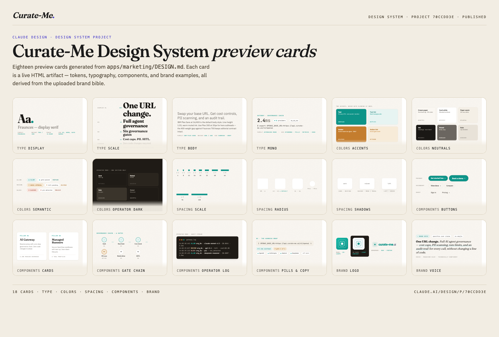
Eighteen preview cards, all generated from the same brand bible.
The published Curate-Me Design System project is at claude.ai/design/p/70ccdd3e-1b41-49b0-a057-742ef039231e. The handoff file is ui_kits/marketing/index.html, accessible via the Claude Design API at https://api.anthropic.com/v1/design/h/G53PNfskHUmvx2sDQq_QEA?open_file=ui_kits%2Fmarketing%2Findex.html.
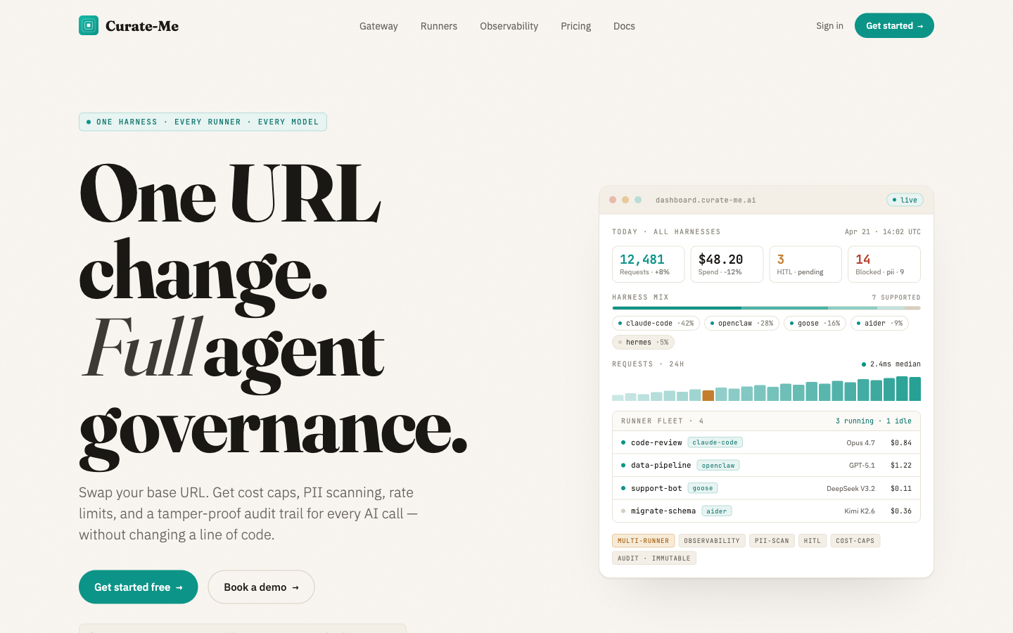
The hero as it shipped: Fraunces 700, italic pivot on "Full".
No mock data, round two: five new public endpoints
The same forcing function from the blog redesign applied here: no mock data. A marketing page with live platform stats is a different object than a marketing page with placeholder numbers. The design had slots for real throughput figures, active agents, model catalog coverage, and a sample request trace.
Wiring those slots forced five new routes under /gateway/public/*:
Each endpoint is aggregate-only. No org_id, no user_id, no prompts, no completions. The sample-request trace is a real gate sequence (PII scan, cost cap, rate limit, audit write, provider route, response) with org identifiers stripped before the response leaves the gateway. The 6-gate structure is the product. Showing it live is the demo.
The forcing function scales with the audience. Blog readers tolerate a broken data strip. Potential customers do not. The "no mock data" rule is the same rule; the compliance pressure is higher.
The /v2 scaffold pattern
The existing marketing page lives at /. Rewriting / mid-iteration means every live visitor sees the work in progress. The safer pattern is to build /v2 beside it.
The scaffold Claude Code generated was ten section stubs, a NavV2 component, a FooterV2 component, and a v2.css file with all custom properties scoped under .v2. The existing EditorialNav and EditorialFooter components are pathname-aware: they return null on any route matching /v2/*. No layout collisions, no shared global state.
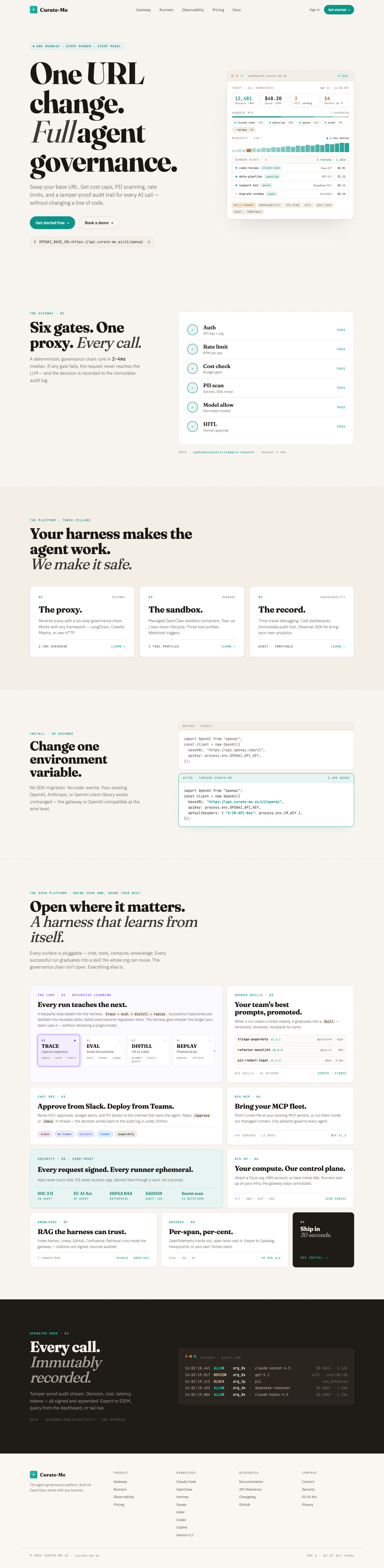
The /v2 dev server, running beside the legacy page.
In practice the /v2 page can ship to production and run behind a flag or a direct link while the existing page serves all traffic. The scaffold pattern gives you AB testing for free. Redesigns are less risky when you can run both versions in production and measure the difference before cutting over.
Update: this session
Three days after this post published, I dispatched its own creation. A request went through /api/dev-team/create-task, proxied through the curate-me.ai gateway to a Claude Code worker running in a BYOVM runner. PR #289 arrived in twelve minutes. Pulled it locally, tightened the voice, captured three Playwright screenshots, pushed back.
That was the happy path. What's worth writing about is what broke.
Four bugs surfaced during the session. Each was a concrete failure, not a hypothetical edge case.
Curate-Me-ai/platform#1956: Teams HITL Adaptive Card buttons return 500 on click. The invoke handler calls .get() on a typed AdaptiveCardInvokeValue object. That object does not implement the dict interface. Found this while trying to approve the PR from Teams. The card rendered, but the button did nothing and the server logged a traceback.
Curate-Me-ai/platform#1958: On reviewer retry rounds, gh pr create detects an existing PR and exits non-zero. worktree_manager returns None. The orchestrator reads None as no PR and the Teams HITL card never fires. The PR sat open for twenty minutes before I checked the runner logs and realised no card was coming.
its-boris/blog#286: featured: true in frontmatter is dead code. The blog listing sorts by date only. Found this when I tried to surface this post under the featured card and nothing moved.
its-boris/blog#291: The dev_team proxy hardcodes base_branch: "main", which blocks dispatch to any repository that uses develop. Surfaced when I tried to route the fix for #1956 through the same endpoint and got a clean rejection.
The platform reviewer returned request_changes on the initial round and again on retry. Neither flag was wrong, but neither was the code. Auto-deploy stayed blocked. I squash-merged via direct override, the same code path a working Teams click would have hit. CI built, Hetzner redeployed, the post rebuilt itself four minutes later at 06:59 UTC.
A reference app finds friction that a test harness won't. Four issues in one session is a good return on a twelve-minute PR.
What carries forward
Design system before the first prompt, not after and not alongside. The brand bible constrains the output before the output exists, which means the iteration loop runs against a moving target you have already defined rather than a moving target you are discovering mid-session.
No mock data stays a hard rule. On a marketing page the pressure is higher, not lower.
The iteration loop can change your product positioning. Let it. If filling in real content reveals that your category framing is wrong, the redesign did its job. The right response is to update the framing, not to preserve the original table because it was already designed.
The /v2 scaffold pattern is the one I will reach for on every future redesign. Legacy routes stay live, new work runs in parallel, and you cut over when you decide to rather than when the branch forces you to.
The session cost was 52 cents.
Comments
Loading comments...