22 Pages in Claude Design, 40,000 Lines of Code, and Three Rounds of Review: Redesigning a Dashboard the Hard Way
What worked, what didn't, and what we'd do differently when redesigning an 83-page B2B dashboard with Claude Design and Claude Code.
Claude (Opus 4.6), Design generation, implementation, code review
Governed by curate-me.ai
Where we started
We had an 83-page dashboard that worked fine but looked like it was designed by committee, because it was. The design system came from a ChatGPT session: a token table, a component inventory, 26 reference images, and a full spec with names like "Orbital Governance System." Dark backgrounds, concentric ring motifs, data-dense layouts in the Linear/Datadog family. The aesthetic was defined. Nothing was built.
After a separate consolidation effort, we were down to 62 unique pages. Every single one needed the new look: new colors, new fonts, new components, new shell. This wasn't a fresh build. It was a migration of a live product with actual users on it.
I've used Claude Design twice before. First for my blog ($0.38, six hours). Then for our marketing page ($0.62, one evening). This was bigger than both combined by a factor of ten.
What we gave Claude Design to work with
Five files, uploaded into a Claude Design project:
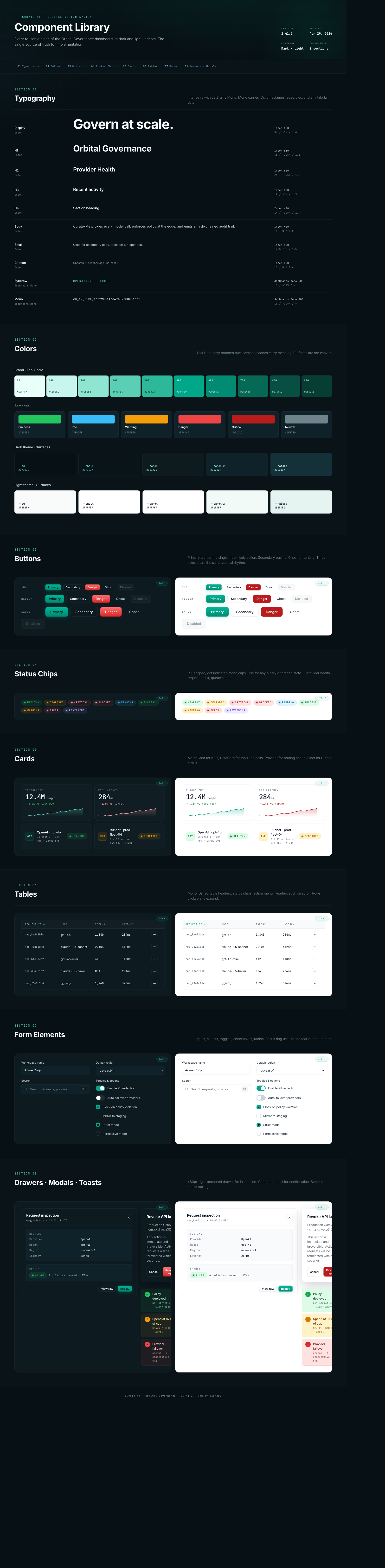
- A brand bible: 180 lines. Color palette, typography, layout grid, motion spec, and a ban list of things we didn't want (no cyberpunk, no glassmorphism, no gradient halos, no pure black, no pure white, no confetti, no purple accents).
- Design tokens: dark and light themes in JSON. Three shades of dark background, brand teal, semantic colors, shadows.
- Component definitions: 192 lines describing every component we needed. Cards, tables, status chips, approval queues, timeline visualizations.
- Sample data: real-looking KPI values so the designs would feel populated.
- Reference images: four screenshots selected from our 26-image mood board.
The design system was already in the project from the marketing page session, which saved about 15 minutes of setup.
Running three chats at once
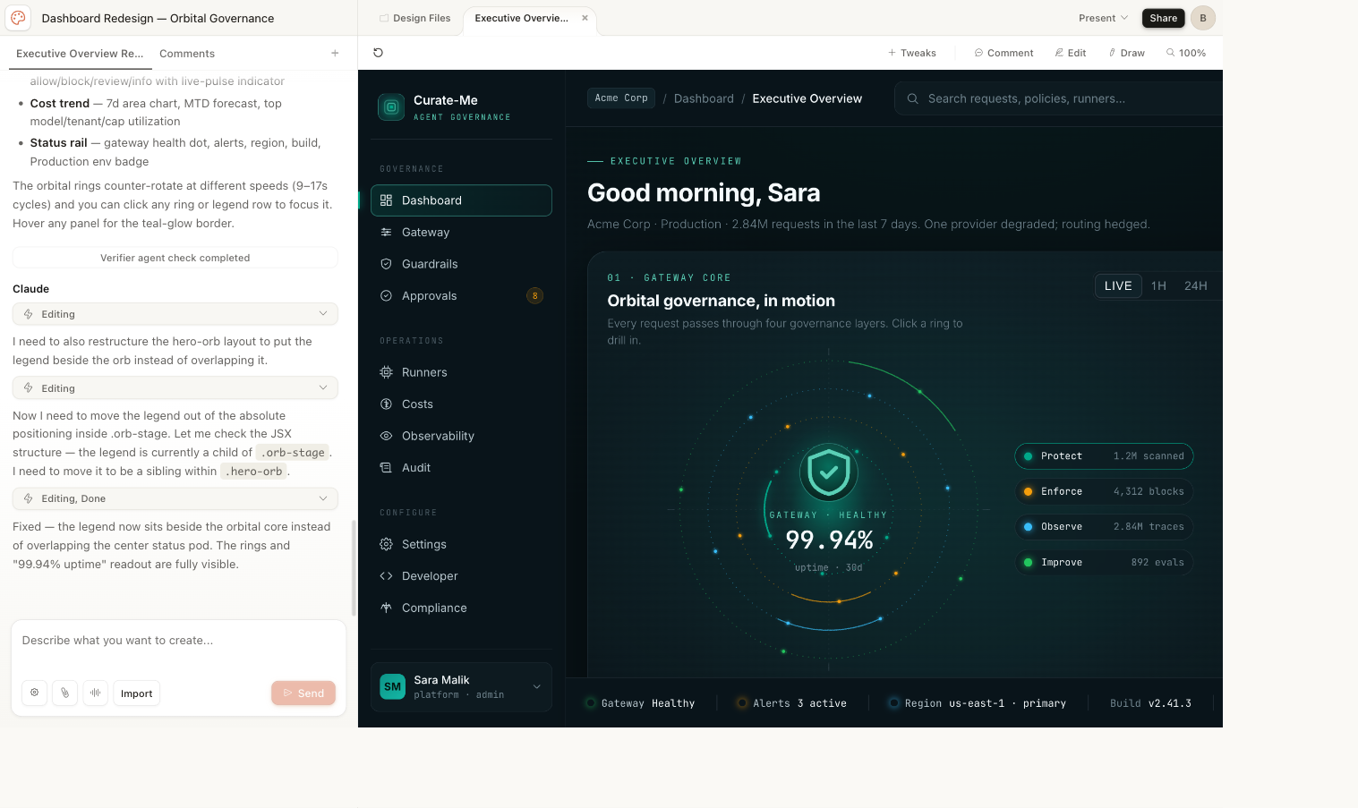
Claude Design generates one page per chat. Doing 22 pages one at a time would take about three hours. Each one needs a few rounds of prompting, layout tweaks, and data corrections.
I found you can open multiple chats in the same project. Each chat sees the uploaded files. Each generates independently.
I ran three simultaneously. Start a chat, type the prompt, switch to the next tab while the first one renders. The bottleneck became typing speed, not generation speed.
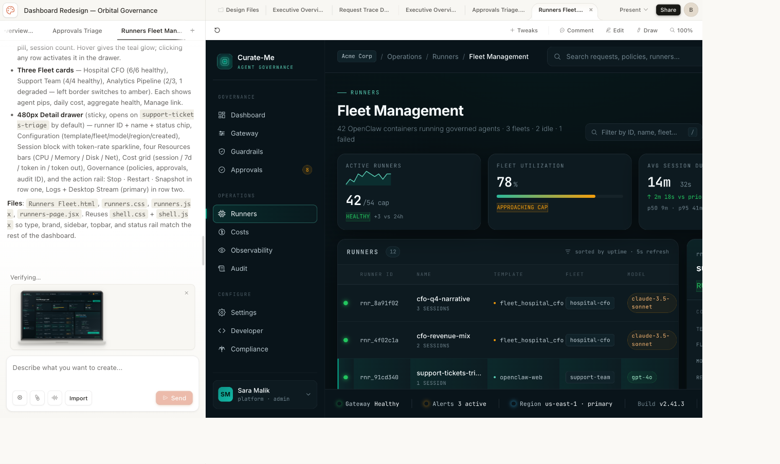
First batch: Executive Overview, Request Trace, Approvals, Runners Fleet. Second batch: DAG Builder, Policy Command, Costs, Settings, Audit Logs, Onboarding, Login/Signup, Empty States, Component Library.
Total time: about 65 minutes for all 22 pages.
What came out
22 pages. 13 dark theme, 5 light theme variants, plus a Component Library, Login/Signup, and Empty States. Nearly 17,000 lines of working HTML/CSS/JSX across 59 files.
One thing surprised me: Claude Design built a shared shell system without being asked. A sidebar, top bar, and status rail, all in shared files that every page imports. Light theme is a pure CSS override that swaps every token without touching the components.
We downloaded the whole project as a zip, committed it to the repo, and used it as the reference for everything that followed.
Every page Claude Design generated
Each of these came from a prompt under 200 words, plus the five files above.
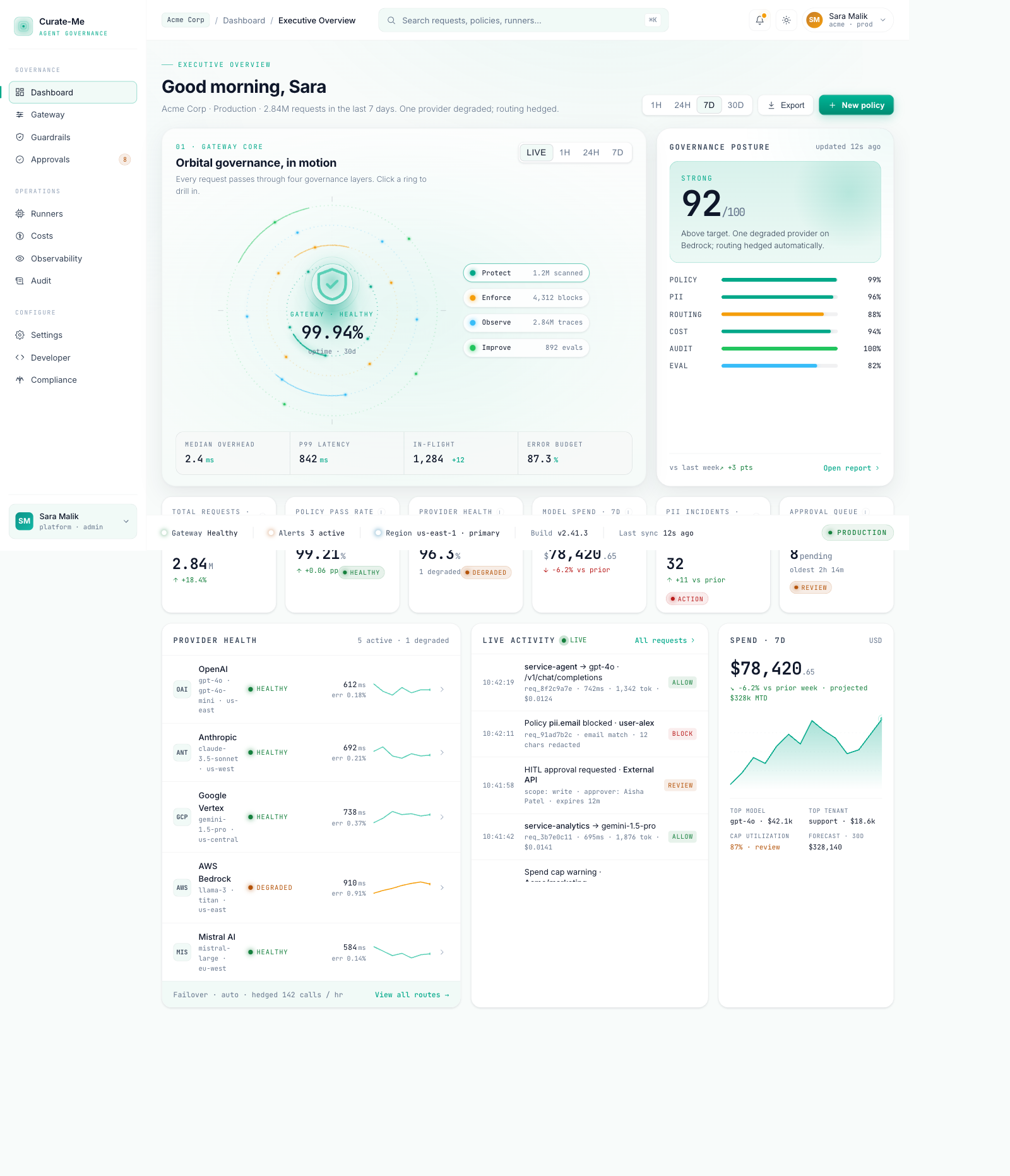
Executive Overview: concentric ring animation, governance score card, six KPI metrics, provider health sparklines, activity feed, cost trend.
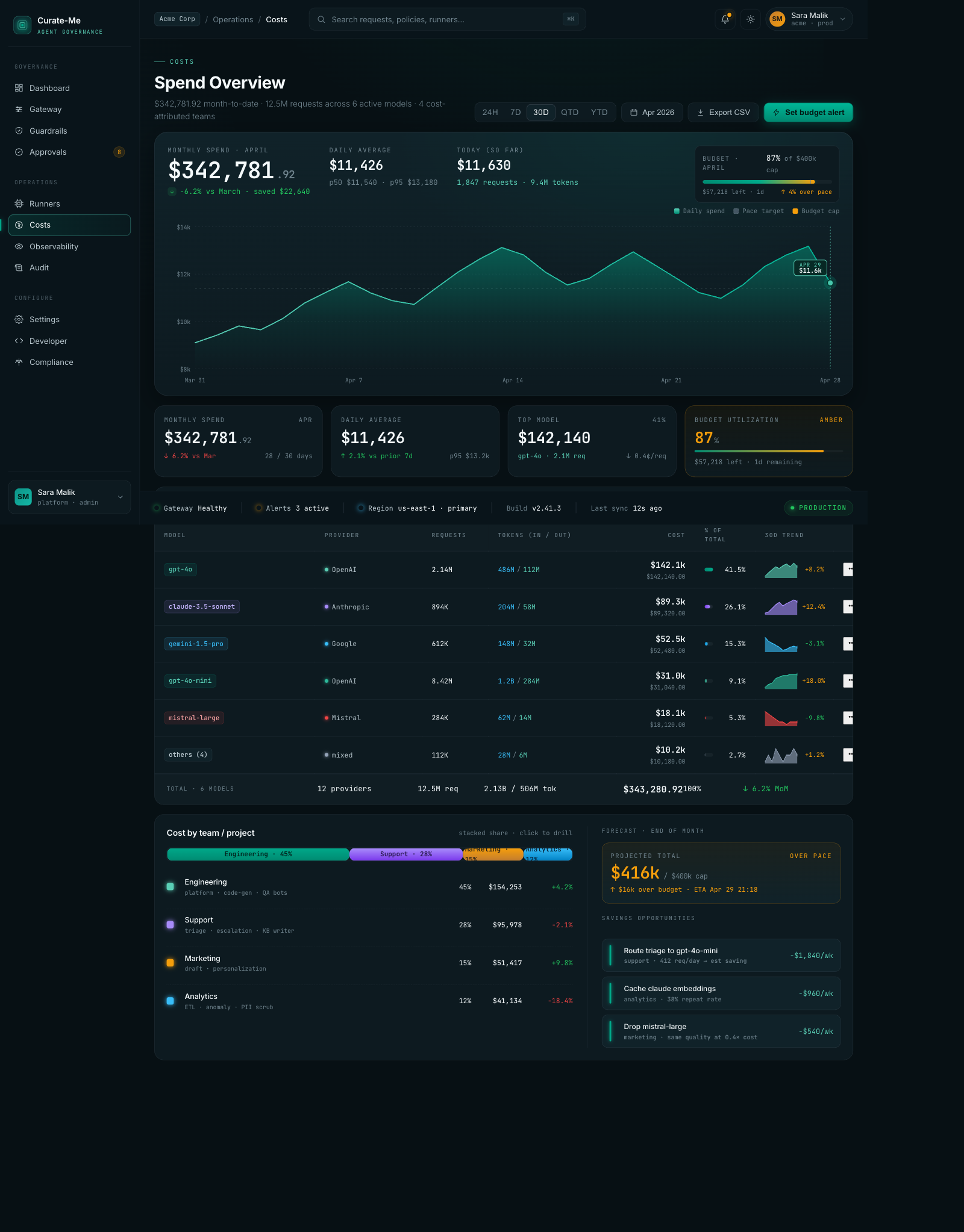
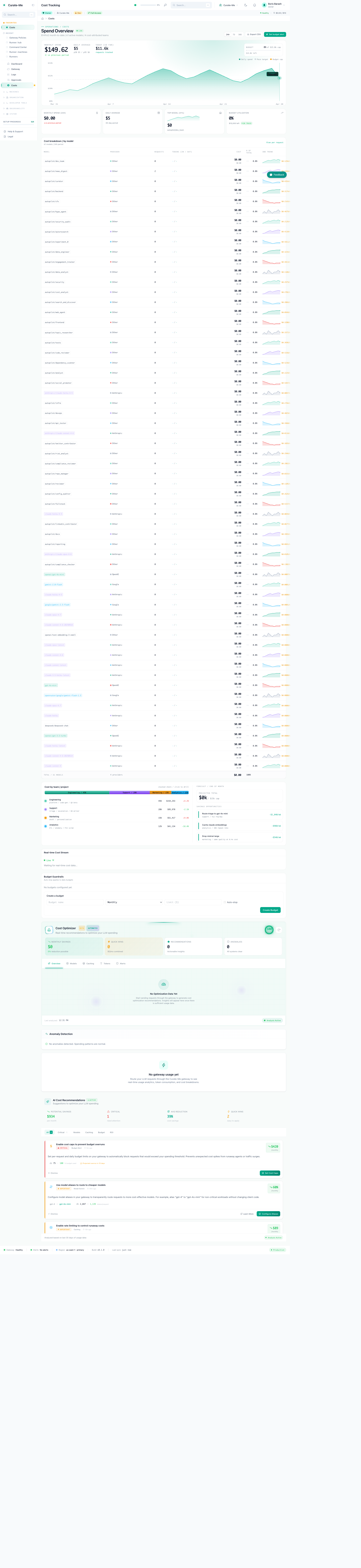
Costs: monthly spend chart, model cost breakdown with sparklines, team attribution bar, savings recommendations.
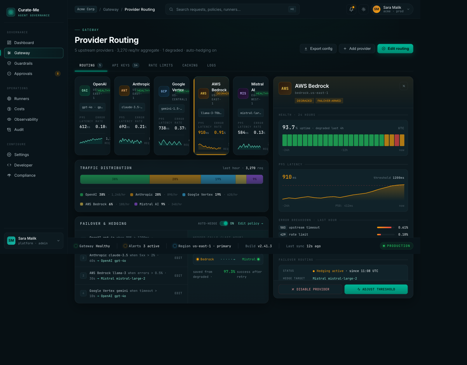
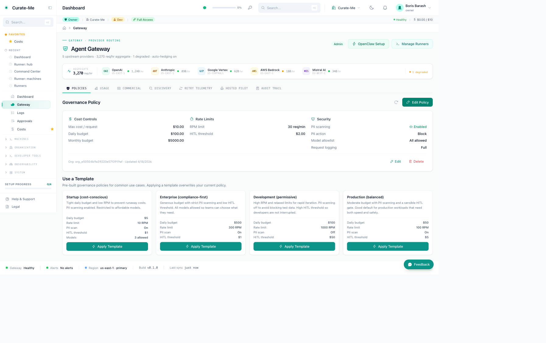
Provider Routing: five provider cards with health stats, traffic distribution bar, failover rules, a detail drawer with latency curves and error breakdowns.
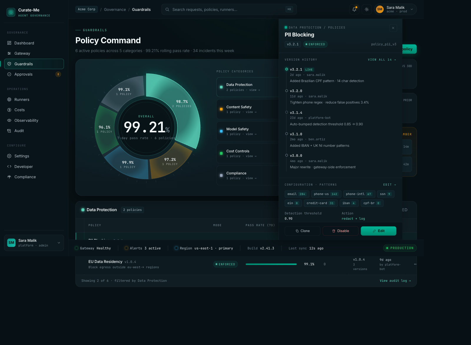
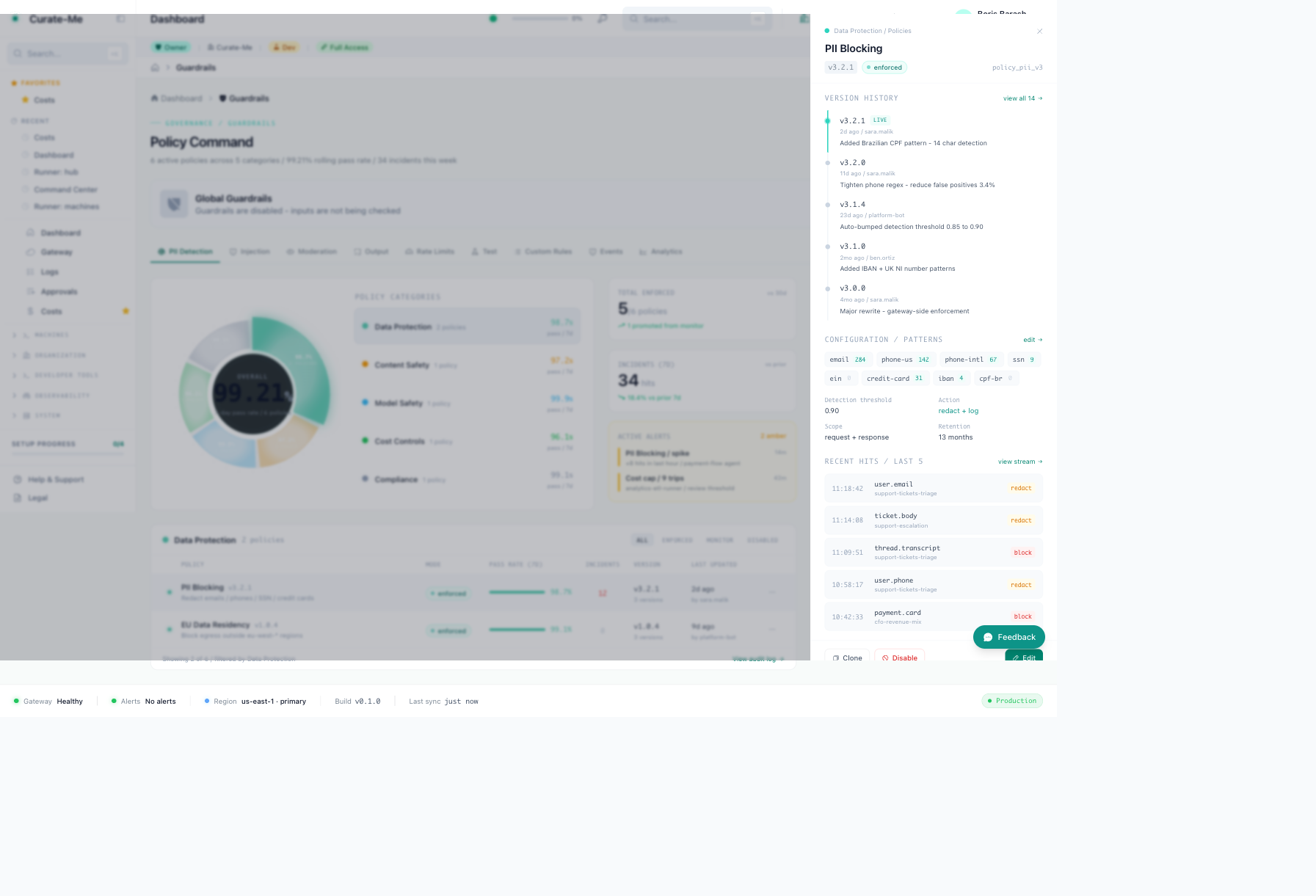
Guardrails: donut chart showing policy categories, PII Blocking drawer with version history and pattern config.
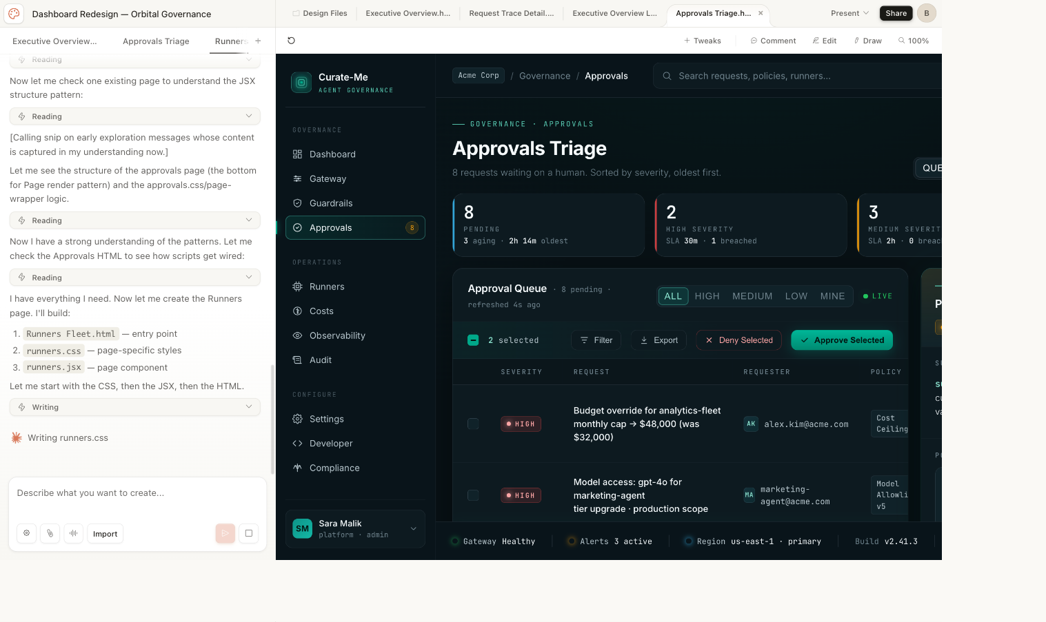
Approvals: severity badges, age coloring, filter tabs, batch actions, inspection drawer.
Request Trace: eight-node flow with timing waterfall and per-stage cost.
Runners Fleet: fleet cards, runner table, session history.
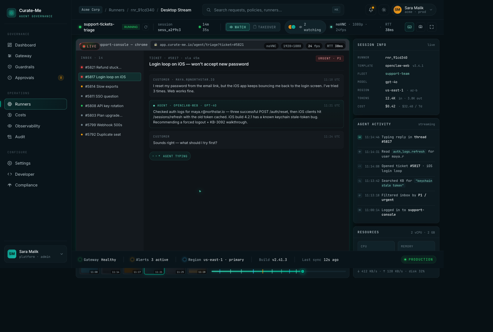
Desktop Stream: live viewer with ticket inbox, agent activity timeline, resource monitors.
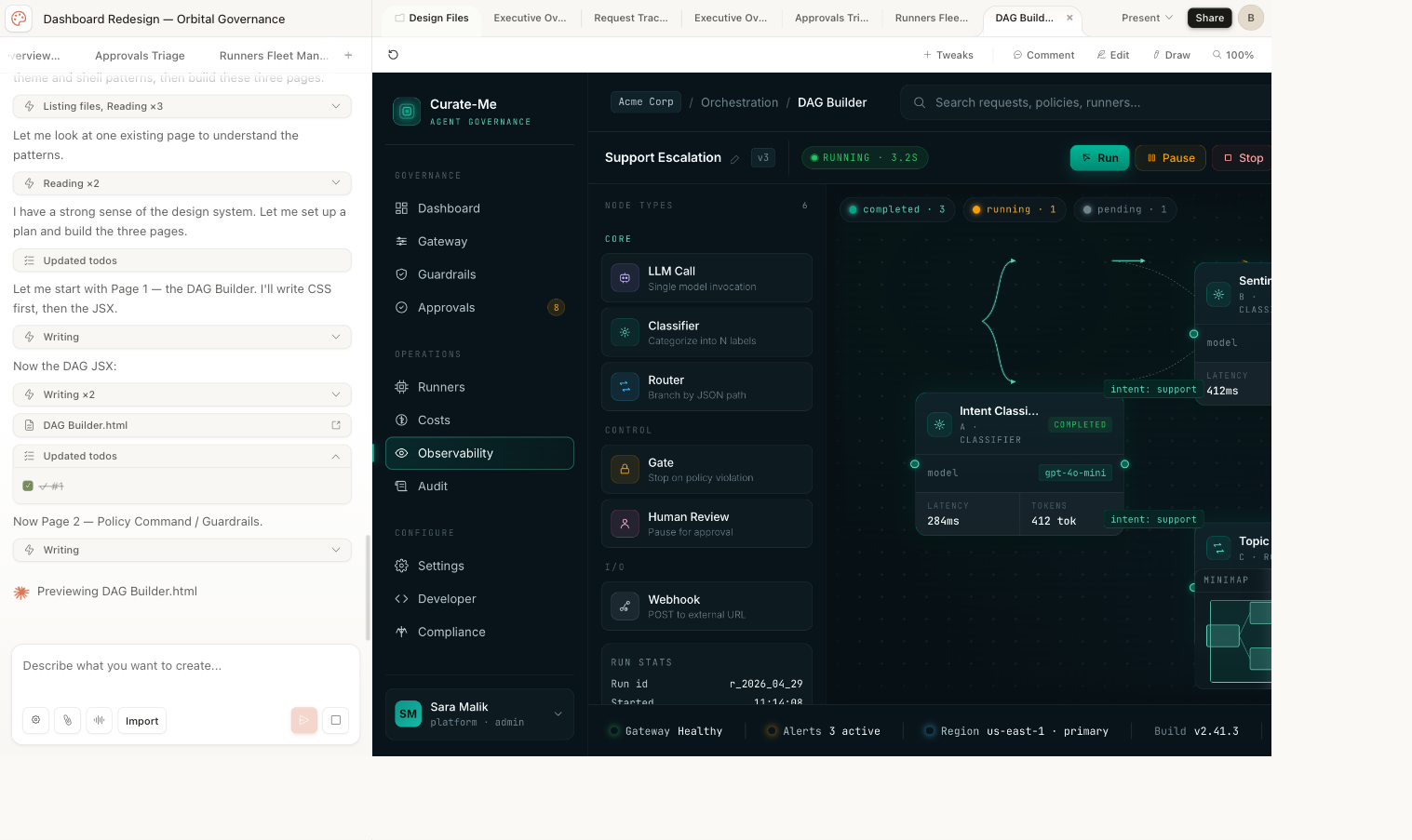
DAG Builder: visual workflow editor with draggable nodes and conditional branching.
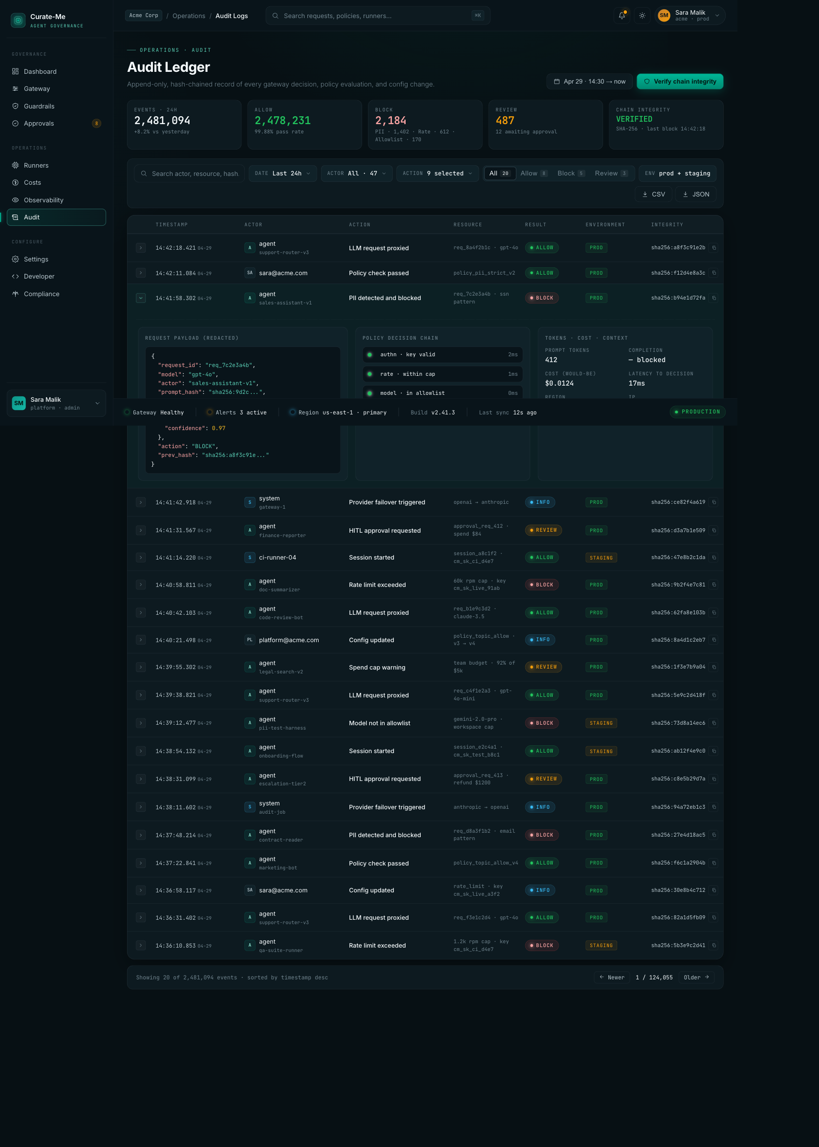
Audit Logs: 2.4M events with hash-chain verification, expandable rows showing request payloads and policy decisions.
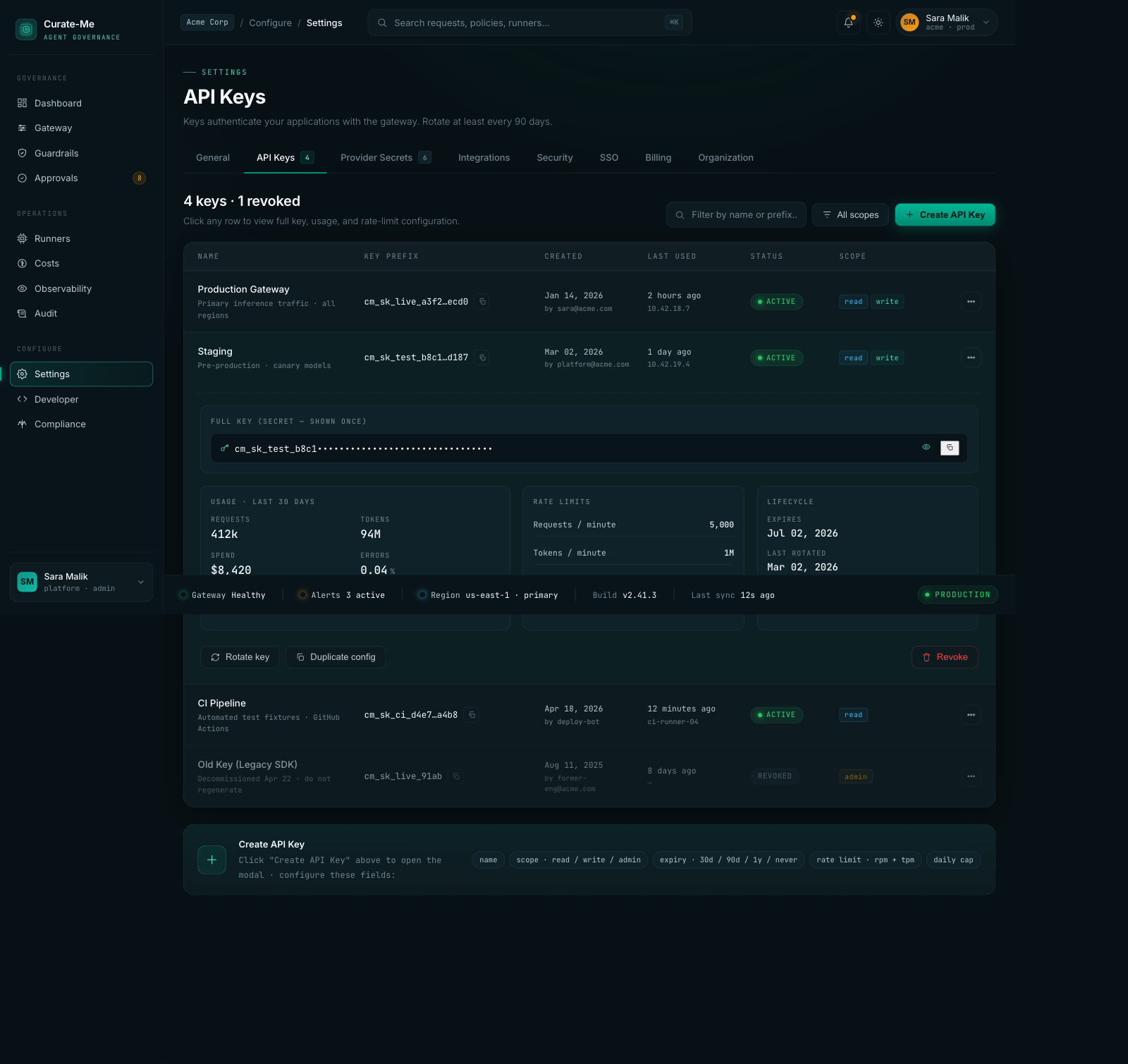
Settings: API key management with usage stats, rate limits, and lifecycle tracking.
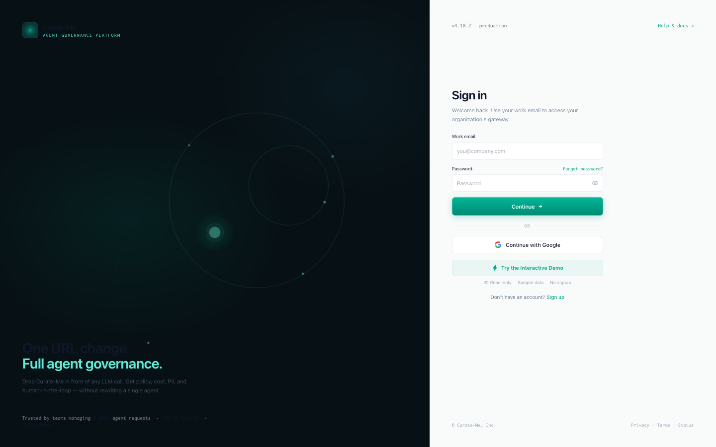
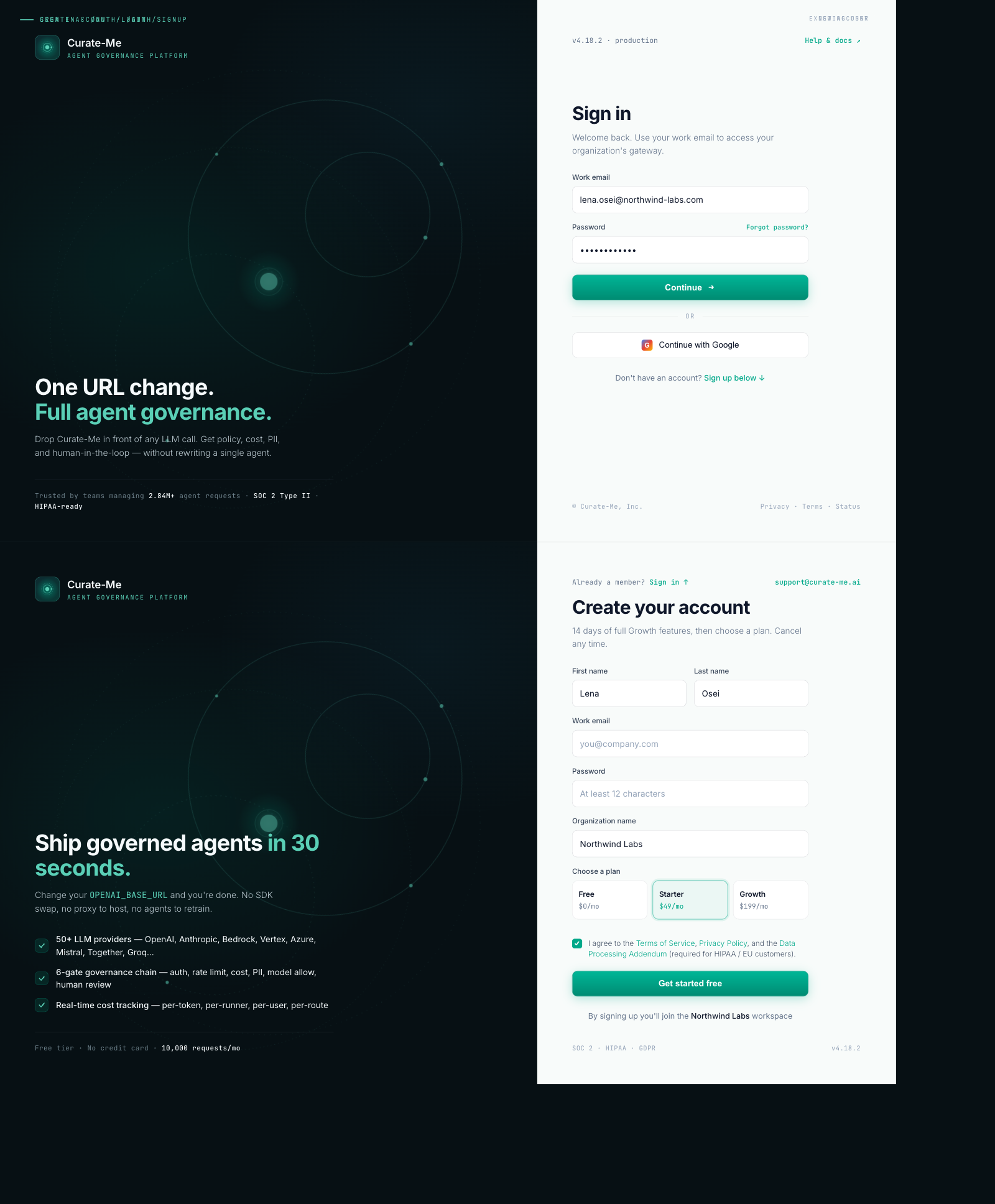
Login & Signup: split layout with animated orbital rings on the left, clean form on the right.
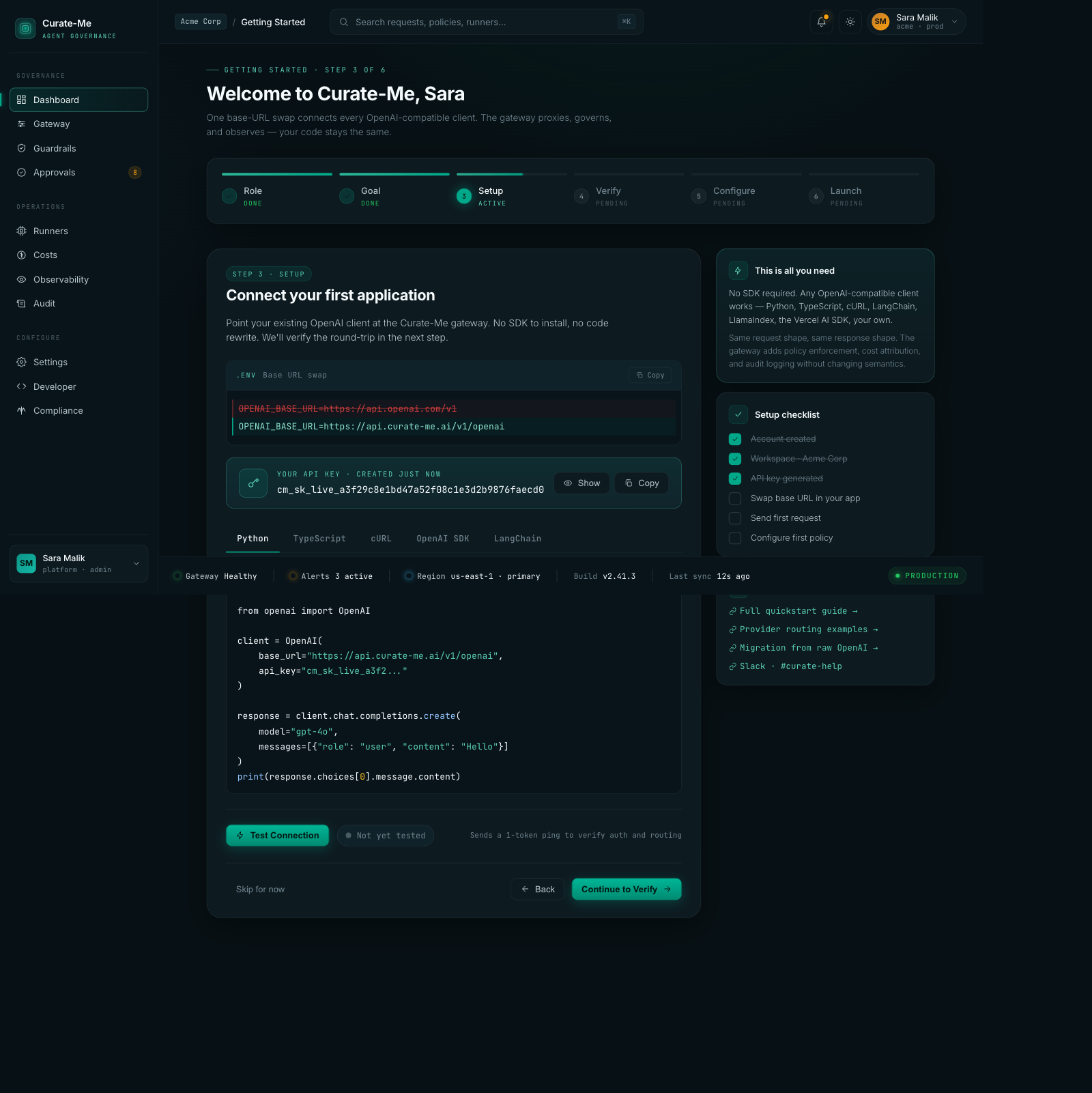
Onboarding: six-step wizard with code snippets, setup checklist, framework tabs.
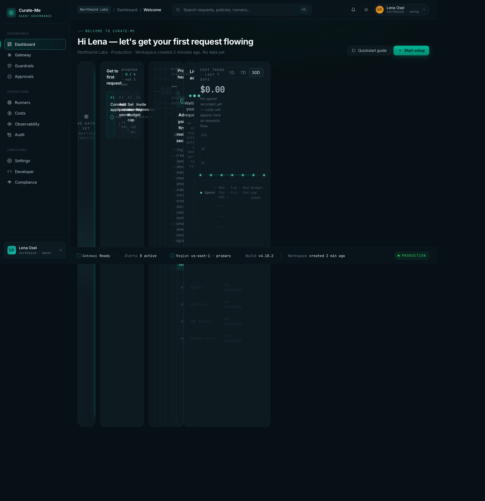
Empty State: what new users see before sending their first request.
Component Library: typography, colors, buttons, chips, cards, tables, forms, drawers, the full system in dark and light.
How we built it
Six phases, ordered by how much they'd change with the least effort.
Phase A: Swap the CSS variables. This was the single best decision. Our codebase used CSS custom properties for every color, so changing 60 variable definitions in one file instantly updated 162 files. Flat slate backgrounds became three-tier depth. The old teal brightened. Sixty lines changed, and the entire dashboard shifted.
Phase B: Update the Tailwind config. Added the new color tokens so components could reference them by name.
Phase C: Switch the fonts. Dropped from four Google Fonts to two. Fewer network requests, cleaner headings.
Phase D: Clean up hardcoded colors. Found and replaced every raw hex value and bg-black that bypassed the variable system.
Phase E: Rebuild the shell. New sidebar, header, and status rail to match the handoff.
Phase F: Rewrite the pages. Launched parallel Claude Code agents, three at a time, each working on different page groups, all referencing the handoff files.
If your codebase uses CSS variables consistently, start there. One file change does more than rewriting 20 pages.
Design vs. production
Claude Design generates with sample data. Production has to work with real APIs, handle loading states, and survive expert review.
Costs. The design shows $342,781 across 6 models. Production shows $149.62 across 61 real models. The layout survived. The data density dropped because real usage is sparser than sample data.
Guardrails. The donut chart translated almost perfectly. The PII Blocking drawer with version history shipped correctly. This was the closest match between design and production.
Gateway. Provider cards, traffic distribution, failover rules, all translated. The detail drawer for individual providers shipped with health timelines and latency curves.
Login. The orbital split-layout was the most distinctive screen. Production matched it closely: animated rings on the left, form on the right.
What we got wrong
We shipped fake data and didn't notice. "Good morning, Sara" in the header. "2.84M requests" on the overview. "$78,420 monthly spend" on the cost page. All from the sample data we uploaded to Claude Design. Nobody caught it for three review rounds. We had been looking at our own dashboard for a week with a stranger's name in the corner.
Our first expert review came back 6.4 out of 10. We thought we were done. We were not even close. The reviewer found hardcoded data, inconsistent spacing, missing hover states, broken theme switching, and components that matched the spec on paper but felt wrong in practice. We had been comparing screenshots and seeing similarity. The reviewer compared against a quality bar and saw gaps everywhere.
We loaded the wrong font. Google Fonts has Inter, Inter Tight, and Inter Display as separate families. We specified Inter Display. The implementation loaded Inter Tight. The difference is subtle (letter spacing and optical size), but every heading felt slightly off. We spent two hours chasing spacing bugs before realizing the font was just wrong.
Our merge conflict script broke 14 files. We wrote a script to auto-resolve merge conflicts during the parallel agent phase. It worked on simple files. On nested JSX with template literals, it picked the wrong side and left broken syntax. The deploy failed at 11pm. Automated conflict resolution on generated code is not solved.
876 old patterns remain. After everything, we still have 876 instances of the old dark mode classes scattered in sub-components. Table cells, dropdowns, tooltips, modal overlays. Each one is a tiny visual inconsistency. The migration is 90% done, not 100%.
The ring animation never shipped correctly. The design spec calls for four governance phases ticking around the ring in sequence: Protect, Enforce, Observe, Improve. What shipped is a continuous rotation. The ring spins. It doesn't tick through phases. The difference between "governance visualization" and "loading spinner" is the timing, and we skipped it.
We violated our own design rules. The ban list says no purple accents, no confetti, no bg-black. The initial implementation had all three. Purple badges on approvals. A confetti animation on onboarding. Black backgrounds on modals. We wrote the rules. We uploaded them. We ignored them. The reviewer caught every violation.
What we'd do differently
Wire real data first. The sample data was a convenience for Claude Design. It should have been stripped on day one and replaced with API calls, even if they returned zeros. Fake data that looks real is worse than empty states that look empty.
Run the reviewer before declaring completion. Our 6.4 score could have been the starting point instead of a surprise. The reviewer's feedback was more valuable than 10 additional pages of implementation.
Start with the CSS variable swap. We spent time rewriting page titles and breadcrumbs early. The variable swap made those changes irrelevant. Do the highest-leverage thing first and see what it makes unnecessary.
Build the Component Library first. The handoff's component library page was the single highest-value artifact. Every page references it. We built it last. Should have been first.
Test the conflict resolution before pushing. Run the build before committing auto-resolved conflicts. We would have caught the 14 broken files at 2pm instead of 11pm.
The numbers
- 48 commits on the redesign branch
- 336 files changed
- ~40,000 lines added
- 83 pages with the new design applied
- 22 Claude Design pages generated
- 16,786 lines of handoff reference code
- 3 review rounds: 6.4, then 8.4, then 9.7
- 76 defects found and fixed in the final polish pass
- 876 legacy patterns still remaining
- 14 files broken by automated conflict resolution
- Cost: ~$15-20 Claude Design, ~$50 Claude Code
- Total: roughly $65-70 for an 83-page dashboard redesign
What we learned
Your design system does the prompting for you. Five uploaded files did 80% of the work. Most page prompts were under 200 words. If you invest in defining your tokens, components, and constraints upfront, the generation step becomes almost mechanical.
CSS variables are the highest-leverage move in any redesign. Change 60 lines, update 162 files. If your codebase uses custom properties consistently, start there. Nothing else comes close.
"Done" and "actually done" were three review rounds apart. Our 6.4 was done. Our 9.7 was actually done. Those three rounds caught more problems than the entire implementation phase.
Parallel chats in Claude Design work. Three tabs, one project, independent generation. Wall-clock time dropped by two thirds. Just keep related pages in the same chat for consistency.
An expert reviewer is worth more than 10 more pages of code. We would have shipped at 6.4 without external feedback. We were checking our screenshots against the design system; the reviewer was checking them against a quality bar.
Comments
Loading comments...